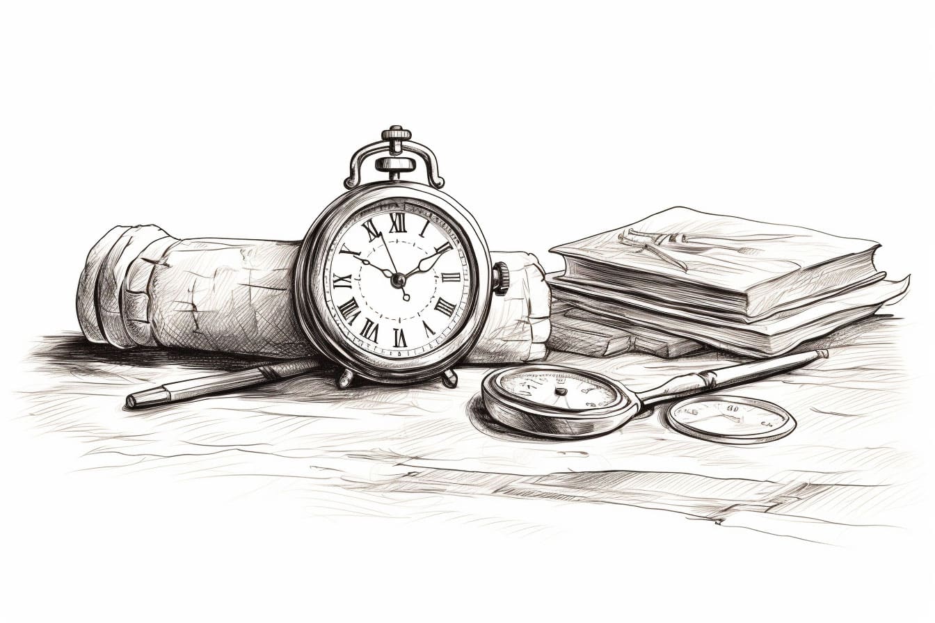
Found an antique pocket watch at the flea market yesterday. Tarnished brass, frozen hands stuck at 3:47.
Spent hours just studying how light plays across its scratched crystal. Amazing how time leaves its marks on everything it touches.
I’ve been thinking about mechanical drawing lately – the precision of gears, the poetry of circles. There’s something meditative about getting those proportions just right. Like you are drawing time.
Reminds me of my first technical drawing class. Professor always said, “Draw what you know, then draw what you see.” With watches, you have to do both.
Did some research on watchmaking. Those craftsmen were artists, too, in their way. Each tiny gear is a study in functional beauty.
The patina tells stories. Every scratch is a moment, captured in metal. Started experimenting with different pencil techniques to capture that aged brass look.
My coffee went cold again while I was working out how to render reflections on curved surfaces. Worth it though – finally figured out that tricky spot where the hour hand casts its shadow.
There’s something about old timepieces that demands patience. You can’t rush a drawing of something that’s measured centuries. Each line needs to carry the weight of time. Pulled out my grandfather’s old watchmaking loupe. The world looks different at 10x magnification. Every surface is a landscape of tiny valleys and ridges. Makes you rethink texture.
The numbers are fascinating. Roman numerals have this architectural quality. They’re not just symbols – they’re buildings made of light and shadow. Been practicing different styles of numerals. Each era had its own typography of time.
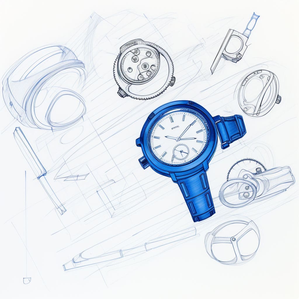
Went to the library to study old watchmaking manuals. Found these incredible technical drawings from the 1800s. The precision is breathtaking. They understood that mechanical beauty isn’t just about accuracy – it’s about rhythm.
The curator showed me this fascinating piece about watch face design through the ages.
Every decade had its own idea of how time should look. Started thinking about how we visualize minutes. Why circles? Why not squares or spirals?
Tried drawing the watch in different positions. Noticed something interesting – the emotional quality changes with the angle. Face-up feels like a portrait. Side-view becomes landscape. Three-quarter view tells a story.
Oliver (my cat) knocked over my ink bottle while I was working on gear studies. But you know what? Those splatter patterns looked exactly like the wear patterns on old watch faces. Sometimes accidents teach us more than precision.
Speaking of precision – bought some new technical pens. The 0.1mm is perfect for those tiny gear teeth. But here’s the trick – don’t draw every tooth. Suggest them. Let the viewer’s mind complete the pattern.
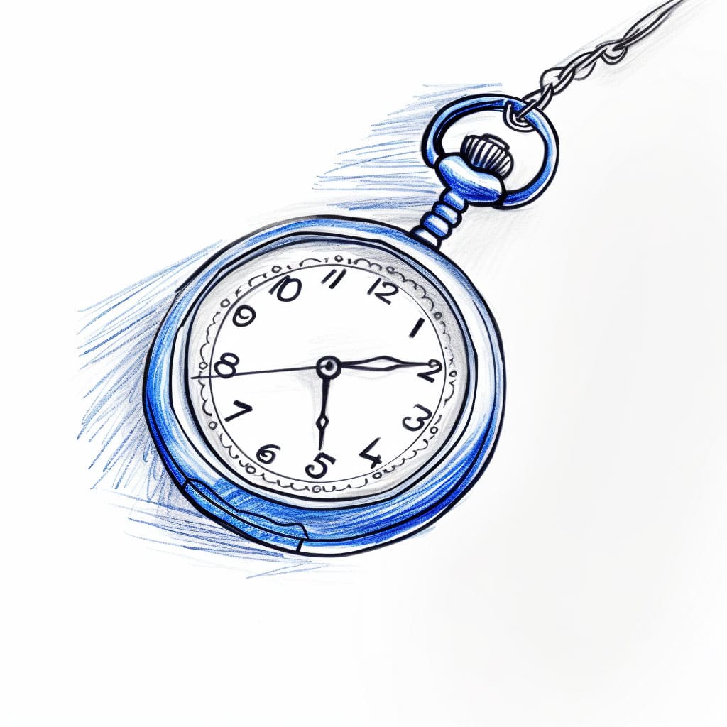
The chain attached to my flea market find has this beautiful drape. Like drawing fabric, but with rhythm built in. Each link catches light differently. Nature repeats its patterns, even in manufactured things.
Had a breakthrough today. Was struggling with showing age in my drawings – how do you draw time itself? Then realized – it’s not about adding details. It’s about strategic erasure.
Time doesn’t add, it takes away.
Next week, I think I’ll start a series of studies focusing just on watch hands. There’s something poetic about those thin slices of metal that carve up our days. But for now, my coffee’s cold again, and I’ve got some gear patterns to practice.
